
Making the contact form and final touches
I decided to create another page in my website because I wanted to include a feature that users could interact with. I felt that I didn’t have that component in my home page. Although I included social media links that users could click onto (and would be redirected to its corresponding social media platform), I felt that it was too static.
As a result, I created a message/contact form on a separate page. This can be found when the Get in touch button in my contact section is clicked.
I have referred back to my high-fidelity prototype as visual basis to build my message/contact form. Since it looked very similar to my contact section, I copied the codes for the background and heading style/s then proceeded to change the heading text. I also included a hamburger menu and social media links that is similar to my heroSection/landing page.

Creating the form was easy since skeleton provided an example already. I copied the codes and placed it in my page.

I added the vertical line found throughout my website in this page as well (for aesthetic and spacing purpose). I also altered the spacing of the <form> to the vertical line so it is spaced out well. I did this by altering the margin property values.

I wanted to add a name section and text field for it as well so I altered the form values and the layout. I also wanted to make sure that the user would input his/her name and email before he could submit a message/enquiry so I added a <required> for the input. If a user fails to provide this information, a note will pop up as shown below:
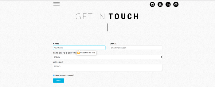

I did this for both my name and email. I also added a character count for my message input to prevent extremely long messages sent to my inbox. I set a reasonable limit of characters by adding the maxlength: x option to my code. To make it more interactive, I also animated the submit button (renamed it to send), so that when a user clicks onto it, it would have a “pressed” effect.
Since I’m planning to use it in the future, I think having a working and effective contact form can help users get in touch with me, whether it be work-related, feedback or just general questions.
Currently, I am fixing exisiting issues in my homepage. Upon feedback from this week’s class, I am experimenting with easier ways to position elements responsively as I was originally altering their top, left, right, bottom values with fixed units. I am also trying to figure out how to fix the footer of my website, because I want it to stay at the bottom of the page (regardless of how much content is inside its prior container).

Hi Stef! I think the addition of your contact form is a great idea. It will be extremely useful for anyone who wishes to contact you further regarding work. Even just having the simple line look great in showing how you and the user can be connected. Your website looks really great and will be an enticing page for anyone who wishes to work with you in the future. All the best!
LikeLike
This looks so professional and neat. I absolutely love the simple yet suave aesthetic you got going for this. I guess the only bit of criticism I would have for this would be that maybe make it so that the hamburger menu and the social media links are on the far ends of the page because at the moment, it just looks like there is some excessive blank space on those sides of the website.
LikeLike
Hey this is looking so professional. The way you’ve structured your page is very organised and looks exactly how any proper website would be designed. It is simple but yet very purposeful and gives users straight forward options into where to go and what to do on your website. The little added touches like links to social media and having the option to send a copy to yourself is a nice touch and definitely adds to your site. Overall your website is looking great but as you said you need to work on easier ways of positioning your content rather than using too many margins otherwise it might make it easy to accidentally mess the layout of everything up.
LikeLike
Hi Steph,
I think your contact page is looking awesome! The way you’ve layed it out and the overall design and colour scheme makes it look really crisp and professional. The addition of a reason for contact option is great too, think in the long run it will make it more efficient when people do get in touch and will increase the useability of your site. Keep up the good work, looking forward to seeing your finished site. 🙂
LikeLike
Hey Steph, your website is very impressive, Your aesthetic is spot on and i think the neutral tones work perfect together…you have a great eye for design!. I also really like the small touches where you have put certain words in bold, and added a line in the middle of the page to break it up. My only piece of criticism would have to be with your social media icons and hamburger bar. There is a lot of white space left on the screen and i believe it would look more ‘pleasing’ if they were spread further out onto the sides. I feel like web users are accustomed to that sort of layout, and it would benefit you and your visitors experiences :).
LikeLike
Hey Steph, just had a look through all your progress. What I’m really impressed with is the consistency of your website from the aesthetic through out its functionalities. If there’s anything I could say about your website it’d be that the flow is really effective. I like that you summarize almost every content in one long page which is very easy to follow. Overall I had a good user experience scanning your website 🙂
LikeLike